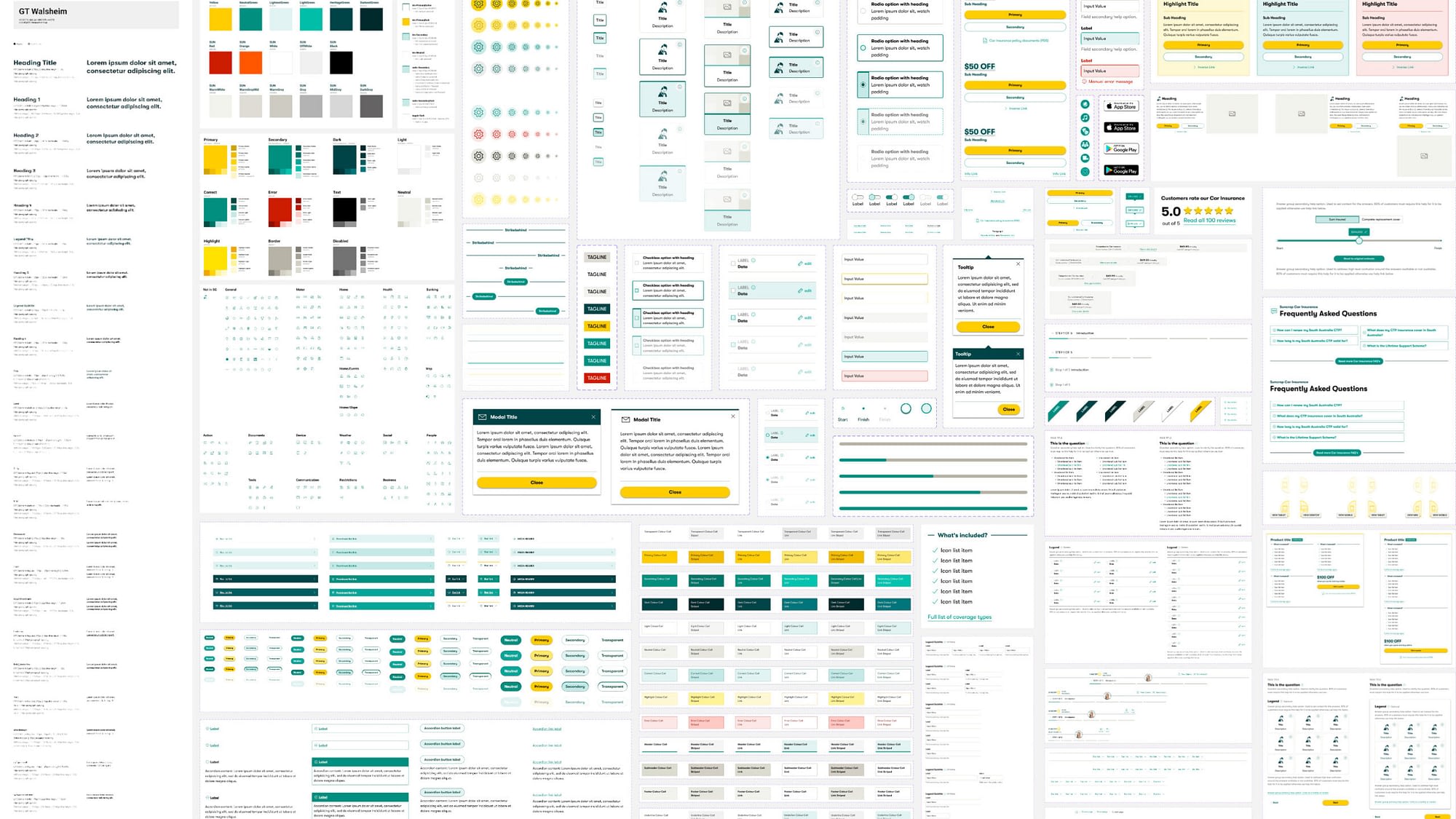
Suncorp Figma design system consists of standardized styles, components and guidelines that allow teams to build multiple, consistent interfaces among multiple brands (AAMI, Suncorp, GIO, Apia, Shannons). Not only helps the UX team produce more consistent user experiences, but it also bridges the gap between design and development.
When I joined the team, Suncorp had recently transitioned from Sketch to Figma, and the design system was in its early stages, with only base and component levels established. I led the team in refining, building, and implementing the design system up to the section level for five brands. This included gathering feedback and insights, establishing guidelines and processes, and conducting testings to ensure the design system met user needs.
5
Brands
20
Libraries
583
Styles
2063
Components
7876
Inserts in files

Challenges
- Brand identity: Each brand likely has its own unique identity and visual style, which need to be reflected in the design system.
- Consistency: Ensuring that the design system is consistent and accessible across all brands and fields requires a clear understanding of the use cases.
- Scalability: The design system needs to be scalable and flexible enough to support the needs of multiple brands, as well as any future products or services that may be added.
- Collaboration: Building a design system for multiple brands requires collaboration and communication between different teams and stakeholders, such as designers, developers, and product managers.
- Maintenance: Maintaining a design system requires ongoing updates to ensure it stays relevant and effective. Coordinating updates and changes across different brands was challenging.
Atomic Design
At Suncorp, we refer to six distinct Atomic Design levels as Base, Components, Patterns, Sections, Templates, and Pages.

Design Process
Design components following a clear process and focus on one component at a time, then roll out to other brands. This is found to be most efficient as it reduces confusion and inconsistencies.
🔍 STEP 1: Research
- Research libraries to gather domain knowledge about the history of the component
- Review available resources and the current state of the component in the style guide
- Identify existing and potential use cases for the component
- Assess the accessibility of the component
🤔 STEP 2: Analysis
- Reflect on the effectiveness of the component and identify any successes or challenges
- Propose solutions, including the creation of a new component if necessary
- Engage stakeholders to gather feedback and input
✏️ STEP 3: Design & Testing
- Design and build the new component
- Test it using identified use cases
- Check responsiveness on different devices
- Verify that all text, colors, icons, and components are properly linked to the correct libraries
- Review the design stakeholders
📄 STEP 4: Implementation
- Make a list of changes to be implemented
- Brief the style guide team about the updates
- Review the updates to ensure they are correct

Outcomes
Our design system enables best practice principles and methodologies to be automatically applied in a practical sense to our work, and in a way that our team across multiple brands can reuse. It is powerful enough that we can drag and drop our componentry into our work in real time allowing us to redesign and explore concepts with other designers and stakeholders efficiently.
✅ Consistency among brands
✅ Coherence with Style Guide
✅ Best practice for use cases
✅ Components Accessibility
✅ Simplicity of build
✅ Easy to use