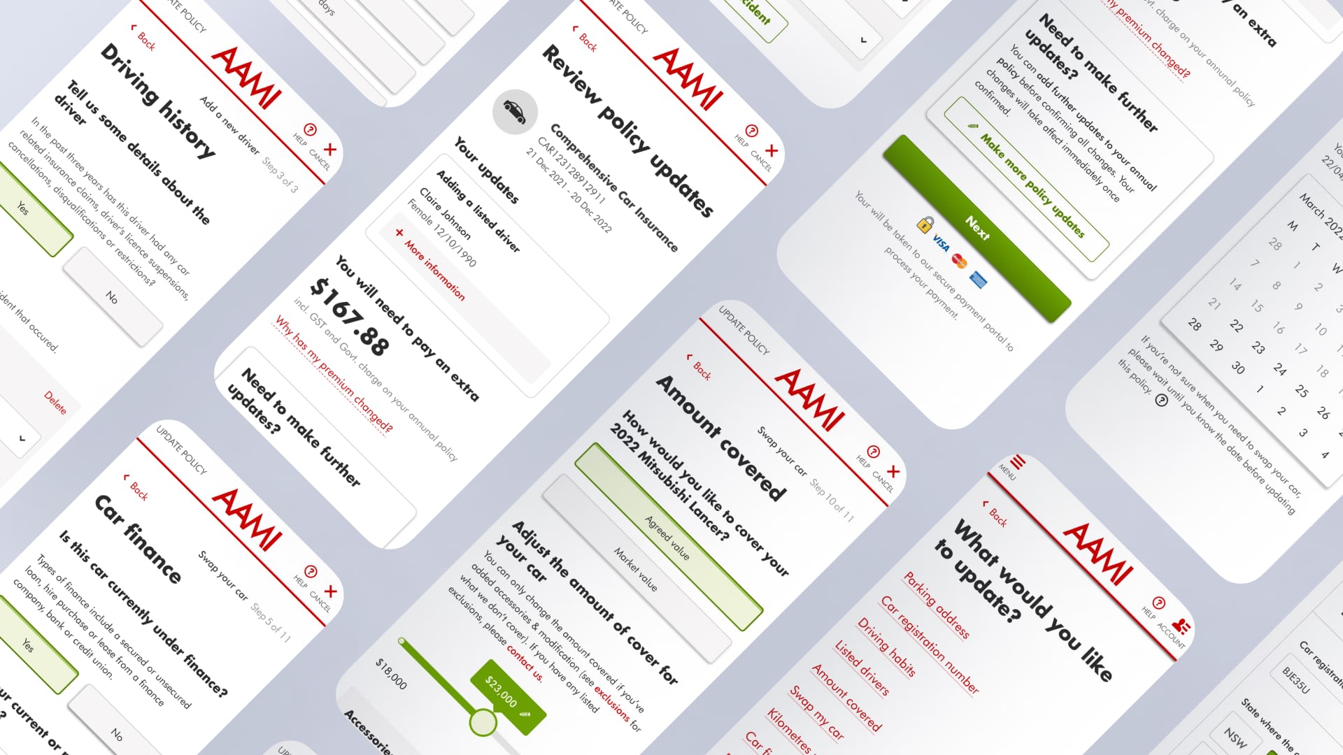
AAMI aims to provide customer a seamless and intuitive digital experience and drive online transactions to represent 70% of the total interactions. However, the existing legacy Policy Self Service platform for insurance policy amendment transactions has several issues like a high drop-out rate, disjointed experience, poor findability and lack of contextual information for the customer. To improve this, we worked on a 6 weeks sprint to deliver a new design framework for transactions, making it easier for customers to view their policies and make changes.
Discovery
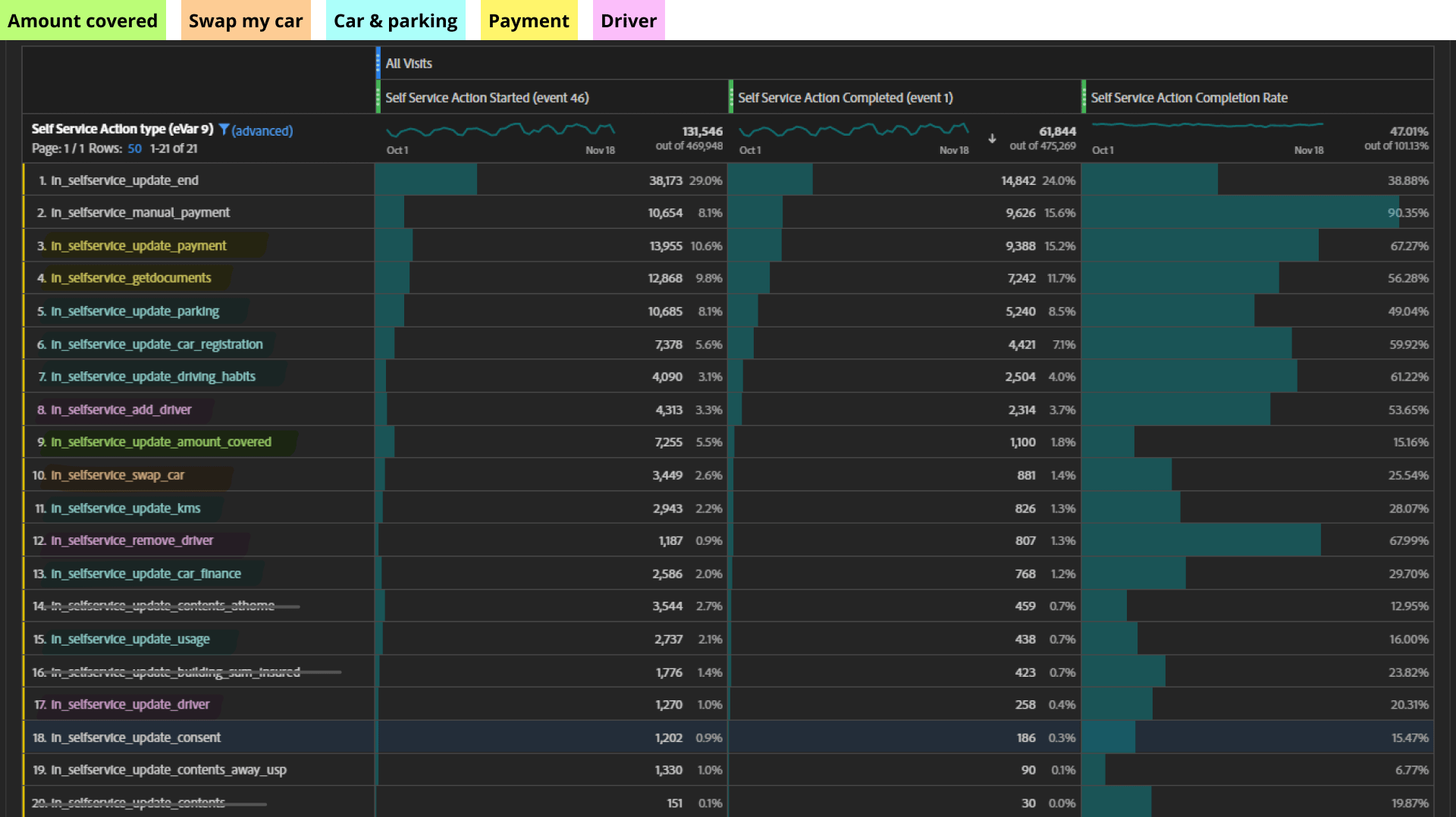
Based on the Policy Self Service platform data, we observed a high drop-out rate for multiple policy amendment transactions, particularly the Swap My Car transaction where 47% of the customers drop out on the first page.
After scrutinizing the screens and flows with the product owner, we evaluated the usability, findability, credibility, accessibility, and desirability factors. Based on this analysis, we identified the following pain points:
- 🧐 A complicated and confusing user interface with an unintuitive navigation system.
- 😮💨 Inefficient amendment flow that does not permit customers to make multiple changes in one transaction.
- 😵💫 Lack of contextual information, for example, customers were not provided with details regarding why their premium is affected.
In addition, we organized a workshop with call center staff who possess direct experience with the challenges customers encounter when performing policy amendment transactions. This allowed us to gain a deeper understanding of how they interact with customers and the solutions they provide in various scenarios. This was particularly helpful in finding the right balance between the information we can provide (such as premium changes) and the transparency of the portal.
Design
Update Policy Screen
The original Update policy screen had an overwhelming amount of information that caused confusion among users. However, after conducting user testing, we discovered that the transaction titles were self-explanatory, which gave us the confidence to simplify the design. We decided not to include a description for each title since it was unnecessary and only added to the clutter on the screen.
Transaction Flows & Screens
Our primary goal was to reduce the time it takes to complete transactions. To resonate with the customers, we created personas that represented different types of customers and drew sketches to visualize the design concepts for various scenarios.
Examples of scienarios and sketches
As part of our redesign process, we carefully analyzed and optimized the flow and visual treatment for each transaction. For instance, we took a closer look at the Swap My Car transaction, which previously had 11 steps and a low completion rate of just 25.5%. After identifying the pain points, we re-sequenced the steps, improved the information hierarchy and simplified input process.
The biggest challenge we faced was enabling users to perform multiple changes within a single transaction. We explored multiple design possibilities such as the shopping cart idea (make changes together and pay once) and the best next action idea (provide users with the most relevant changes to continue). After three rounds of user testing for both desktop and mobile ends, we concluded that adding a “making further updates” feature on the review page was the best solution. This feature allows users to focus on one task at a time.
Premium Screens
We optimized the Premium screens with policy details and change review sections. We provided users with more information regarding the premium change and added a tool tip to explain why the premium was affected. By collaborating with product owner, call center and content writer, we were able to balance the need for transparency with the limitations of the business rules and find ways to provide the necessary information to users. This ensured that users understood the reasons behind any premium changes to their policies and helped maintain their trust in the system.
Confirmation Screens
We enhanced the confirmation screens by presenting the payment confirmation, summary of changes, and next steps in a visually clear hierarchy. After conducting three rounds of testing, users gave us extremely positive feedback on this page. They particularly appreciated the “You’re all done” message with the prominent green tick. Mobile users, in particular, commented on their satisfaction with having all the information displayed together, making it easy for them to take a screenshot on their phone.
Design Validation
Together with UX researchers, we conducted a total of 3 rounds of testing with 24 users, and in the final round, our design achieved a SUS score of 85.6. This validated our design concepts and demonstrated that we successfully achieved our goals.
- The ability to make multiple changes in a single transaction was well received. This wa seens as an efficient and time saving feature and a novel capability when it comes to managing insurance policies online.
- Simplicity was seen as the best aspect of the Policy Amendment Transactions prototype. Users consistently referenced the perceived simplicity of the transactions and interfaces when being asked about the most enjoyable aspect.
- The ability to complete transaction online is seen as a time saver. The ability to make these changes online is convenient and reduced any concerns about calling and waiting in the quote.
Development
With the iterated and validated design from user testing, I created components, patterns and sections to ensure consistency and scalability of design patterns throughout the project. These design elements are included into Suncorp’s design system for future use.
In close collaboration with the product owner, I developed a comprehensive flow for the multi-change transaction that adhered to the business requirements. Additionally, I created screen flows for each individual transaction, incorporating features such as tool-tip boxes, jeopardy and error screens, duty of disclosure modals, and more.
Collaborating closely with our style guide team, we worked on the key screens that could eventually be provided to developers and rolled out to other brands. We ensured that all design components and flows adhere to the established design system, thus achieving a cohesive and uniform look and feel.
Outcome
We launched the new design framework, and the results were outstanding. We saw a 30% uplift in completion rate for registration transaction, indicating that the new design was successful in addressing the pain points and improving the user experience.


